
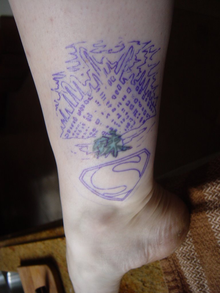
by Jessen of Purple Panther
This design is what I'm planning on getting the day before Comic-con...VOTE NOW!!!!
Any little changes? Any votes for no tattoo?
I've gotten two fishies from Mom saying go for it, but that was before I picked up the actual design today...and now I'm feeling a little nauseous about how big it is (twice the size because the ice fissure is actually the part covering my old kanji.).
Should the S Shield be bigger? Same size as the Fortress? Are the fortress colors right?
It's definitely more hardcore than my little one-inch kanji. This one would probably knock some men out of my dating pool. But then again, did I really want to date them anyway? I don't want to be a senator's wife, right?
What say ye?

7 comments:
So far one vote for "wow that might be too big...how about just the shield somewhere else..."
and one vote for "like it, but prefer the superman 1 movie shield.
Anyone else care to weigh in?
MIM, Eh...pain, shmain. Mom went through worse than this. and You do get a good high after, so I imagine I'll be adrenaline rushing all night before the con. Bad timing, but such is life.
I don't quite get your comment...would you prefer green to the arctic blue? But wouldn't that symbolize the weakness of Kryptonite instead of the FofS?
Unfortunately I do need black, but only an inch of it.
So you vote for the Superman I shield from 1978 as well?
Well it's going to hurt no matter what. But if you're getting it on your ankle, it shouldn't be too bad.
It's a really good looking design, but if you're having any reservations...WAIT. I cannot stress this enough. I know how it is. Once you've committed yourself to getting ink, you want to get it NOW! But it's permanent. So don't rush into it.
Talk about it with your artist (Jessen was the guy who did mine at the Purple Panther--I highly recommend him). You know what you want, so ask to see a few different variations on that theme. If you see an element you like from one design and an element from another, have him combine them. The artist will (or at least SHOULD) work with you until you come up with something you LOVE.
This is a very intimate thing you're doing. It can be a very profound, even spiritual experience. And the reason behind the design and for getting the tattoo adds even more importance. Do not go into it quickly. Do not go into it lightly. If you have any doubts or are unsure about the design, you really should wait. But if you like the design, what it represent and will have no problem looking down and seeing it on your 65 year old ankle, then do it with all speed.
Michael is a smart guy. You got some smart friends, Kid Sis :)
1) I think the design looks pretty unified right now. The blue colouration which leads from the ice to the shield unifies it IMO.
2) I like the shield. Yeah, there are different shields. This one just has to be right **for you** so go with your gut.
A permanent tattoo, like a life-changing treatment, is, as Michael says, an incredibly intimate thing. You can ask for our advice (and I feel really honoured that you did) but in the end, you have to feel really, really right about this... and if you don't, stop. And when you do - whenEVER you do - go for it. (And post photos.)
ronnie
Permanent decision; why rush it? Sleep on it a week or month or three.
Purely as a design, I like the iconography of the deco S by itself...but of course that won't cover anything. Have you tried playing with the colors so the "S" itself is black instead of red, maybe with the background field yellow and the triangular outline red? Or maybe a black S outlined in red? I ask because I think if the "S" itself were black and maybe a little larger, it looks like it might cover the old tat by itself.
I'm not sold on the Fortress. The artist did a nice job, but ask yourself: if you *didn't* have the old design to cover up, would you put all that on there? If you don't like it for its own sake--and I agree that it looks busy to me--then it might end up looking like a wall spackle job that catches your eye everytime the shadows hit it right. Irritating in the long run. Unless the Fortress really speaks to your soul, I'd say give it more thought.
How about a big black bat?
I think it is way too big. Superimpose the S over the Cavern like it is flying out or something and it should be no bigger than 2" X 2" Just my pov. I'm excited for you getting a tatoo! Can't wait to see it!
THAT's interesting. Isn't there a picture from the donner movies of the shield sort of...whooshing? I wonder if that would cover the kanji?
Post a Comment